


Image Credit : Photographer: Thomas Dalhoff
Hindenburg Dalhoff.com
Project Overview
An average home, in a great suburb, with a huge yard was transformed with a clever use of paint and a mix of vintage and contemporary finds. The neutral walls allowed boldly coloured furnishing to mirror the client's beautiful art collection. The furniture layout and vibrant rugs were used to create separate rooms in the open planned living area that flow seamlessly into the outdoor spaces. Again taking our cues from the art, the master suite is a haven of warm neutral tones, perfect for a momentary escape for the parents of four children under the age of seven.
Project Commissioner
Project Creator
Team
Principal Designer: Brett Mickan
Project Manager: Nicholas English
Project Brief
The main aim of the brief was to make a dated and awkward space seem current and create areas for the family to live and entertain in style, while still being extremely child friendly. The ample yard was under-utilised and completely disconnected from the existing home. The clients wanted not only to make the home flow seamlessly into the yard, but also to create luxurious outdoor rooms leading from the interior to the deck and on to the pool beyond. The Street can be quite busy on the weekends, so we needed to soften the facade, create privacy and amp up the street appeal. The look was to be stylish enough to impress and comfortable enough to make you feel like diving into these beautiful spaces. Colour was used not only to relate to the clients impressive art collection, but also to reflect the vibrancy of the young family who live within.
Project Innovation / Need
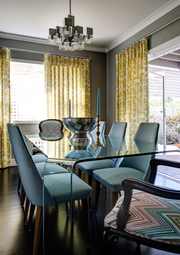
The existing architecture made the entrance hall, formal living and dining area, seem like a large foyer. We reduced the entry way from three steps to two and expanded it both inside, to incorporate the staircase and out, adding a deck and sandstone pathway. This gave us a more defined entrance and created a better connection to the adjoining living room. By keeping the scale of living room furniture low and mirroring an entire wall, we gave the impression that this area was larger. We used a clear glass dining table, giving plenty of room to dine yet taking up very little visual space. Beyond the dining area, we converted a small window into French doors that open onto a new deck, extending the illusion of increased space.
The room that is now the library was a small, unusable area with the only entrance to the backyard. We enlarged the opening from the house and repositioned the door from the side to the back, allowing for better traffic flow and a better furniture layout. We disguised the entrance to the powder room with floor to ceiling built in book cases.
Design Challenge
We were challenged by the existing home's austere facade of dark brown brickwork, mauve mortar, arid planting and a completely paved front yard. The clients did not wish to make large structural changes. This was resolved by removing all paving and installing a soft curving driveway in a sandstone colour. We added a wood detail to the front fence, created a separate entrance gate from the street connected to the house by a curved sandstone path and extended the front veranda and landing. Instead of rendering the brick we painted it, allowing the walls to be softened by the texture of the brickwork. The uneven windows were made to look symmetrical with custom metal sliding panels. The custom pivot door was flanked with nickel plated coach lamps and granite planters. The addition of lush planting completed the transformation.
As the home had standard height ceilings and we wanted to give the illusion of a large open space, we stained the parquetry floors ebony and made all ceiling lights, except for a couple of select feature pendants, discrete recessed fixtures. This gives the focus to the floors, grounding the furniture groupings and making the ceilings disappear.
Sustainability
Although there were few structural changes to the existing home, we did insulate all previously uninsulated walls to maximise the escape of hot and cold air. We replaced all halogen recessed lighting with LED's. This allowed us to reduce the output of both heat and energy.
In line with our design aesthetic, many of the furnishing pieces were vintage and some of the clients existing pieces were re used or reconditioned. Both the floor finish and all paints were water based and low VOC. Where possible, we like to source materials and furniture locally. All the sandstone was from a local quarry.
As the client is a keen chef, we also established a kitchen garden along side the backyard deck and fruit trees scattered throughout the planting.
Interior Decoration
This award recognises building interiors, with consideration given to furnishings, finishes and aesthetic presentation. Please specify furnishings lighting, flooring, colours and fabrics.
More Details