

Project Overview
Davidson undertook a refresh of the iconic Crown Lager brand to both contemporise and reinvigorate the brand, and restore its status as a dominant player in the premium beer landscape.
Project Commissioner
Project Creator
Team
Evan Hawkins, Design Director
Fiona Gray, Client Service Director
Project Brief
Crown Lager is an iconic Australian brand which was first launched to the public in 1954 to commemorate the coronation of Queen Elizabeth 11. Pioneering the premium beer category in Australia, Crown Lager dominated this category for decades as the beer of choice for special occasions. Over the last 10 years however, the increase in popularity of imported beers has resulted in a decline in popularity and relevance amongst this dynamic and changing competitive landscape.
In 2009, Davidson Branding were briefed by Foster’s to undertake a refresh of the Crown Lager packaging, to contemporise the brand and reinstate its cachet as a premium Australian beer.
Project Innovation / Need
Crown Lager has earned a unique place in Australian brewing history having first been brewed in 1919 for diplomats visiting dignitaries. The brands success grew once it was released to the public to commemorate the coronation of Queen Elizabeth 11 in 1954. In a competitive market and facing competition from all corners, from international and boutique brands, to ‘start-up’ microbreweries, it was important to find a way to maintain our existing customers, yet capitalise our unique brand story and history in a fresh and contemporary way to also appeal to a savvy younger consumer.
Design Challenge
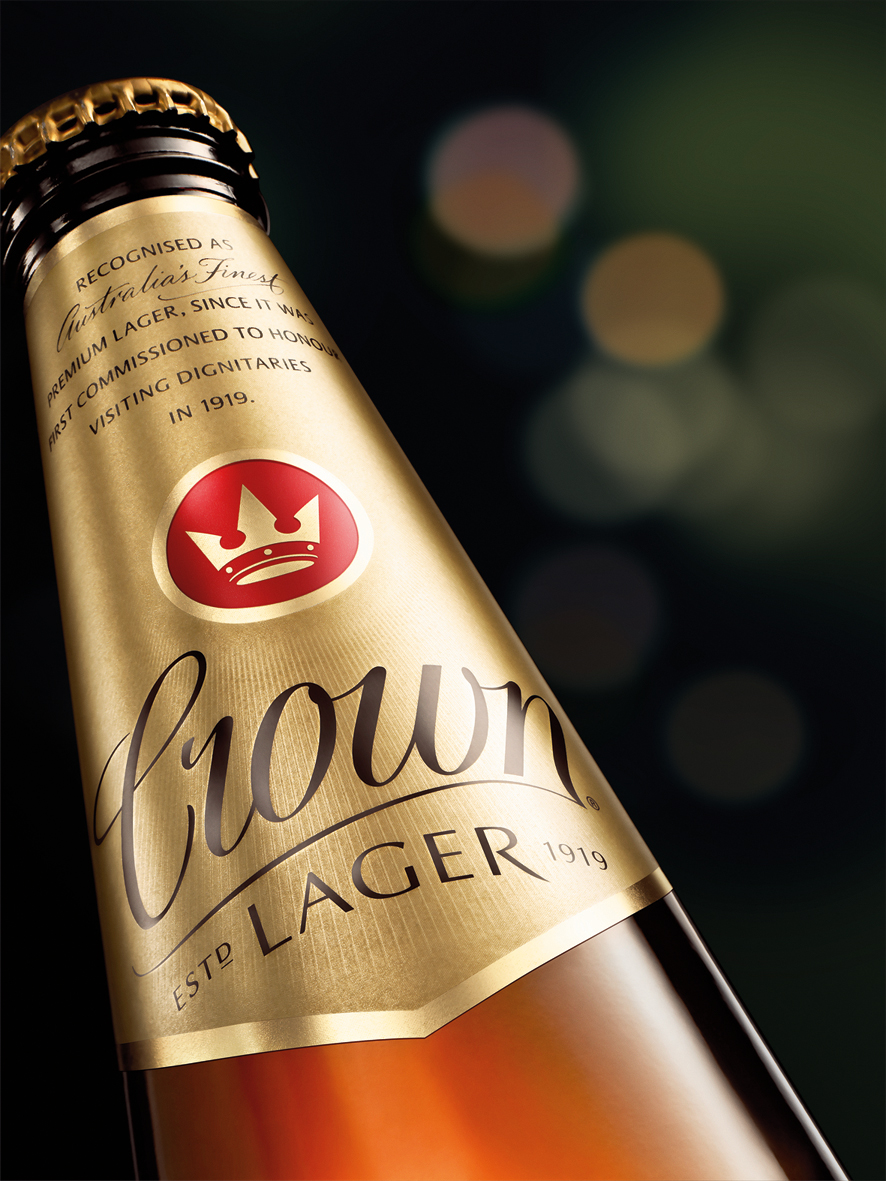
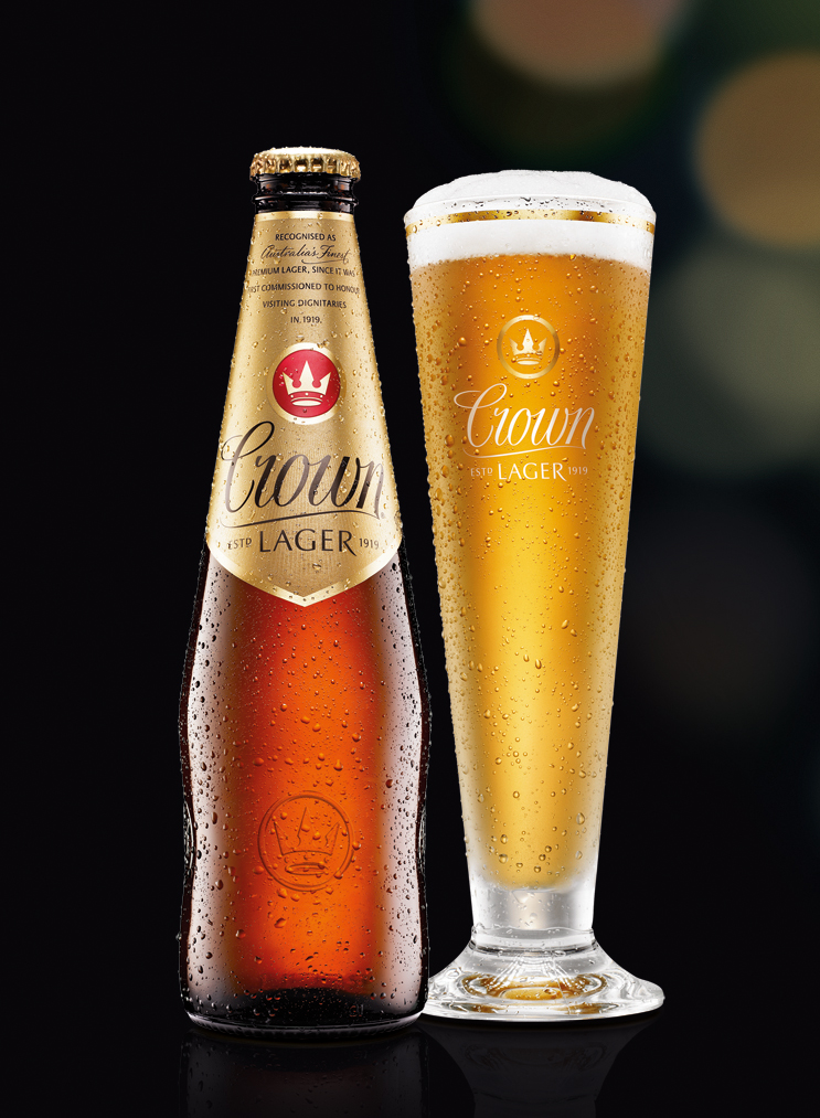
Crown Lager’s iconic bottle shape is both unique in market and immediately associated with the brand, so was to be retained. Research revealed that while consumers also identify Crown Lager by its distinctive gold packaging, the colour itself was perceived as ‘too gold’, or ‘too bling’. This had a negative impact on the brand and contributed to undermining its premium positioning.
After much testing, we arrived at a desired ‘satin’ gold colour and finish which both reinforced premium cues without being ‘too bling’, and maintained brand recognition. Collaboration with suppliers and testing of inks, substrates and print processes was a necessary part of the process to ensure the desired result would be achieved across each substrate and print process.
Sustainability
Through Foster’s commitment to effective management of environmental and social impacts, their suppliers all meet specific sustainability criteria. Davidson have a commitment to recycling and endeavour to work with clients and suppliers who have similar awareness of their social responsibility within the workplace.
Graphic Design - Three Dimensional
This award recognises traditional or digital visual representation of ideas and messages used in packaging design. Consideration given to:
- clarity of communication and the matching information style to audience;
- the approach, including marketing and branding concerns, the dynamics of the retail environment, environmental considerations, and legal requirements;
- the component parts of packaging graphics such as colour rationalisation, information layout, feel and tone of illustration and photography, and finishes, and how they are used in isolation and in relation to each other; and
- the relationship to the anatomy of the structural design.
More Details