


Project Overview
Working with Neeson Murcutt Architects, Frost* helped to bring the new Stanmore Public School Library building to life with a series of signage and environmental graphics.
Project Commissioner
Project Creator
Team
Project Manager: Annabel Stevens
Designer: Sarah Estens, Charlie Bromley
Creative Director: Vince Frost
Architecture/Interior Design: Neeson Murcutt Architects
Signage Contractor: A&W Signs
Carpet Contractor: Onterra Modular Carpets
Project Brief
Frost* Design were commissioned by Neeson Murcutt Architects as Graphic Design consultants on a project that included wayfinding and identification signage for the library building, plus interpretive graphics for the surrounding complex. The site covered a 600sqm 2-level building, with external circulation spaces and a new covered entrance to the school from Holt Street.
Project Innovation / Need
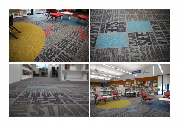
Utilising a bright colour palette and playful typography, colourful identification signs and a custom-printed recycled carpet tile bring a sense of fun to the library interior. As well as providing the necessary wayfinding and identification messaging, signage worked in with the modernist architectural design to help create a dynamic learning environment.
The design approach was also continued outside, with large-scale book quotes painted onto an external walkway to animate the journey through the playground and provide an additional layer of interest and information.
Design Challenge
The challenge was to create an environment that was both functional and stimulating, easy to use yet engaging for a young audience. Our response was to facilitate easy navigation of the library whilst appeal to the students through playful applications of colour and typography.
The traditionally conservative and restrained library environment was abandoned for this project as the need of the audience demanded that the signage and graphics did a great deal more to enrich the school experience. Signage added bold splashes of colour that complemented key architectural features, whilst environmental graphics added a narrative to concrete and carpet – materials that would have otherwise been recessive secondary elements.
Budgetary constraints also determined how we could approach the project, and so where possible our material choices favoured existing floor and wall structures as substrates for signage and graphics, reducing the palette by preventing excessive material consumption.
Sustainability
Sustainability is always an important consideration that underlies all Frost* projects. A major feature in the new library was a custom-printed carpet tile that activated the space and created an overlay of graphic detail onto the architectural backdrop. To minimize materials consumption, the carpet tile chosen was a commercial recycled modular tile, essentially giving the product a second life. To then make this tile suitable for its new vibrant environment, we applied a custom-printed graphic that enlivened its appearance and transformed a standard material into an engaging and unexpected interior feature.
The sustainable initiatives of the new building’s architecture are also highlighted through external environmental graphics. Features such as an underground rainwater tank are showcased through interpretive graphics that communicate these important environmental messages to the building’s young audience.
Graphic Design - Environmental
More Details