[interview] the project story


Project Overview
Principals and its specialist brand language arm, XXVI, were engaged to create a new brand strategy, name and visual identity for Imaging Partners Online (IPO) - one of Australia’s fastest growing teleradiology specialists.
Imaging Partners Online (IPO) are leading Australia in the practice of teleradiology, which offers 24/7 radiology reporting using trained UK and Australian radiologists to provide accurate analysis overnight.
Project Commissioner
Project Creator
Project Brief
IPO had a bold vision for the future, but their name and brand identity did not reflect this ambition or support their leadership positioning.
The teleradiology sector also has perception issues, which adds to the challenge that IPO face as an organisation. Not only did it need to rebrand its own organisation – but it also has an important role to play as a leader of the sector, to help change overall perceptions of teleradiology with its target audience.
The UK arm of the company has different ownership and had a different name and brand. This project needed to find a way to align both organisations under one brand, in order to create a stronger global presence and reinforce a leadership position in the sector.
Project Innovation/Need
Their target audience saw IPO as a good emergency option; a great way to manage work overflow or regional radiology requirements where staffing is more problematic.
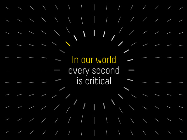
However, given the significant benefits for the industry if they embrace teleradiology, we concluded that they should be positioned as providing ‘everyday critical’ services; a resource that should be embraced as a integral service solution for hospitals – not just an emergency solution.
This has huge positive impacts for hospitals and clinics including more efficient staffing, faster turnaround times and higher quality of radiology reporting. It also allows for more interesting and diverse cases for the radiologists themselves.
IPO also required a new name to reflect their new positioning, global ambitions and ‘follow the sun’ 24/7 business model. Equally, the new name needed to help the organisation stand out from the largely functional naming conventions of the sector.
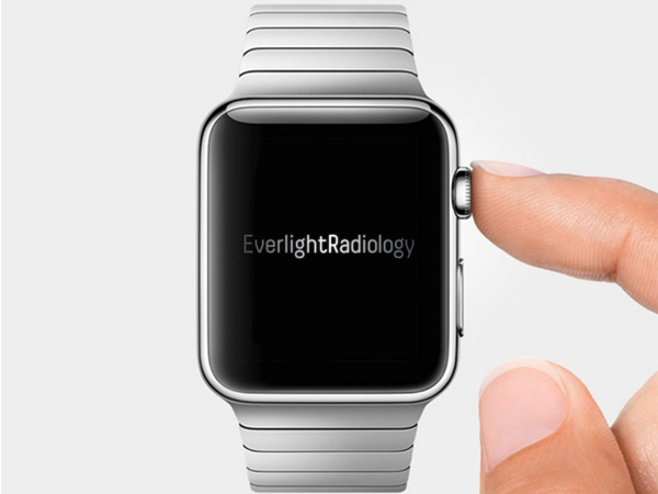
In March 2015 IPO become Everlight Radiology. We were ready and geared to begin the creative development.
Design Challenge
The design challenge was to create a standout identity and tone of voice that appealed to a traditional market segment - one that is not as ready to embrace change. The sector itself is very constrained by convention. We set out to change this.
The new dynamic, visual identity and language positions them as responsive, connected, precise and focused. It seems to connect to human outcomes rather than just the service that is provided. While teleradiologists (like radiologists) do not deal directly with the patient – the analysis and reports they deliver has a direct impact on patient outcomes. We wanted to draw that link more strongly in the visual communications – rather than just holding a mirror up to the profession.
The identity reflects their ‘follow the sun’ business model and clearly demonstrates their ‘everyday critical’ brand idea. It also captures the essence of care, responsiveness and global reach that underpin the company.
Effectiveness
The process we used to formulate the strategy was highly engaging and involved all levels of the business including the board, clinical directors, management, radiologists, and sales and support staff.
This enabled a higher degree of understanding and advocacy for the strategic recommendations and has helped to begin the process of embedding the thinking more deeply in the organisation.
This also led to the new name and identity being widely accepted and understood within the organisation as part of launch.
Staff are now being engaged further around ‘what this means for them’ on a day to day basis and generating clear action plans and ideas on how they will deliver ‘everyday critical’.
Graphic Design - Identity and Branding
This award celebrates creative and innovative design in the traditional or digital visual representation of ideas and messages. Consideration given to clarity of communication and the matching information style to audience.
More Details