
[interview] the project story
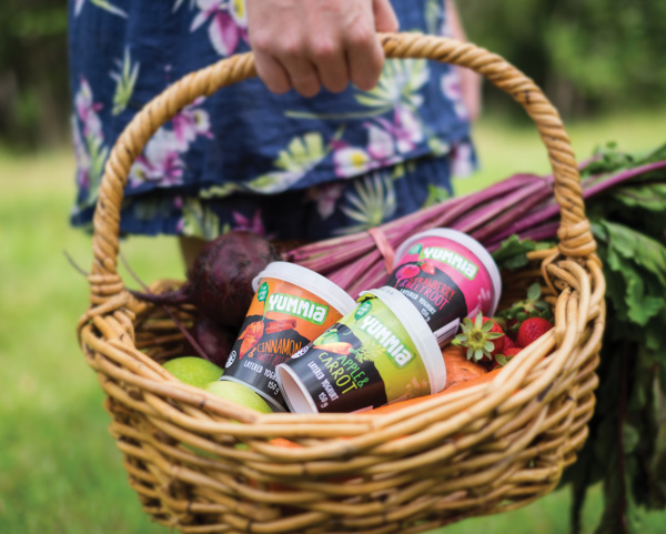


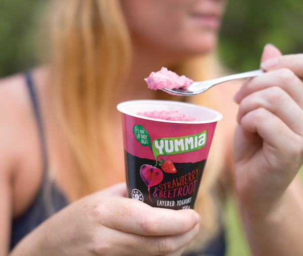
Image Credit : Photography: Stephen Blake
Model: Catherine Simons
Project Overview
The concept was a play on the layering of the product inside, (fruit & veggie purée on the bottom, yoghurt on top) and the idea of digging up your veggies fresh from the garden. The Yummia logo lent itself well to becoming a leaf. The colourful illustration & personable typeface are a reflection on Mia's charming idea, and humble approach to bravely trying something new in this category.
Project Commissioner
Project Creator
Team
Account Director - Gwen Blake
Senior Designer - Lara Ashworth
Creative Director - Mark Haygarth
Project Brief
The Idea of Fruit and Veggie Yoghurts is unique, charming and full of life, and so, we decided, should be the packs.
Project Innovation/Need
On top, the lid playfully entices the consumer with the words, “Dig down deep for a fruit & vege treat.” The top half of the container is a color indicative of the ingredients inside, and the bottom half is black, like the dirt from which the carrots, potatoes, and beets were pulled. Images of these veggies rest just below that middle line, with their leafy green tops poking above the ground as the Yummia logo. The fonts and graphics feature wavy, imperfect lines, making each individual cup feel like it’s one-of-a-kind.
Design Challenge
Tapping into mega trends for real food, of-the-hand and health, the design of these packs appeals to a health-conscious crowd while maintaining the feel of a fun, wholesome snack.
We wanted to create something unlike anything else you would find in the chilled supermarket aisles and give a humble and unique feel to each pot.
Effectiveness
The entire design is hand-crafted and human in its feel, in keeping with the very personal touch that Mia gives to the Yummia brand.
The design helped Mia to sell the product into Woolworths nationwide and it's selling well in its forefront position in the healthy bites fridge.
Graphic Design - Three Dimensional
This award celebrates creative and innovative design in traditional or digital visual representation of ideas and messages used in packaging. Consideration given to:
- clarity of communication and the matching information style to audience;
- the approach, including marketing and branding concerns, the dynamics of the retail environment, environmental considerations, and legal requirements;
- the component parts of packaging graphics such as colour rationalisation, information layout, feel and tone of illustration and photography, and finishes, and how they are used in isolation and in relation to each other; and
- the relationship to the anatomy of the structural design.
More Details